UX/UI Design
Year:
2024
Client:
Too Good to Go
Software used:
Figma, Adobe Illustrator
Objective:
Redesign the Too Good To Go mobile app to improve usability and enhance user satisfaction. The project focused on refining the discovery, reservation, and pick-up experiences to make finding and collecting surprise food bags more intuitive, transparent, and enjoyable.
Problem:
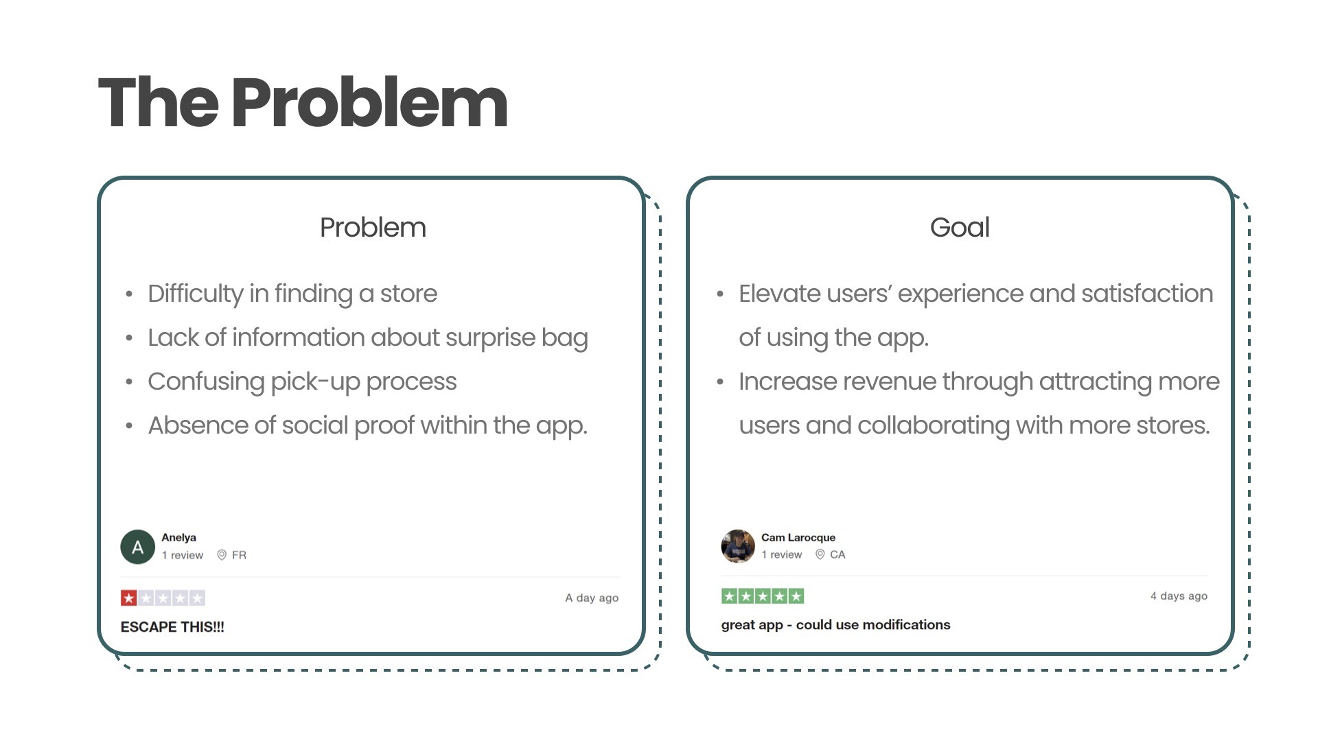
Through initial analysis and user feedback, we identified several pain points within the app:
Difficulty finding specific stores or food types.
Lack of detailed information about surprise bags (e.g., dietary restrictions, expiry dates).
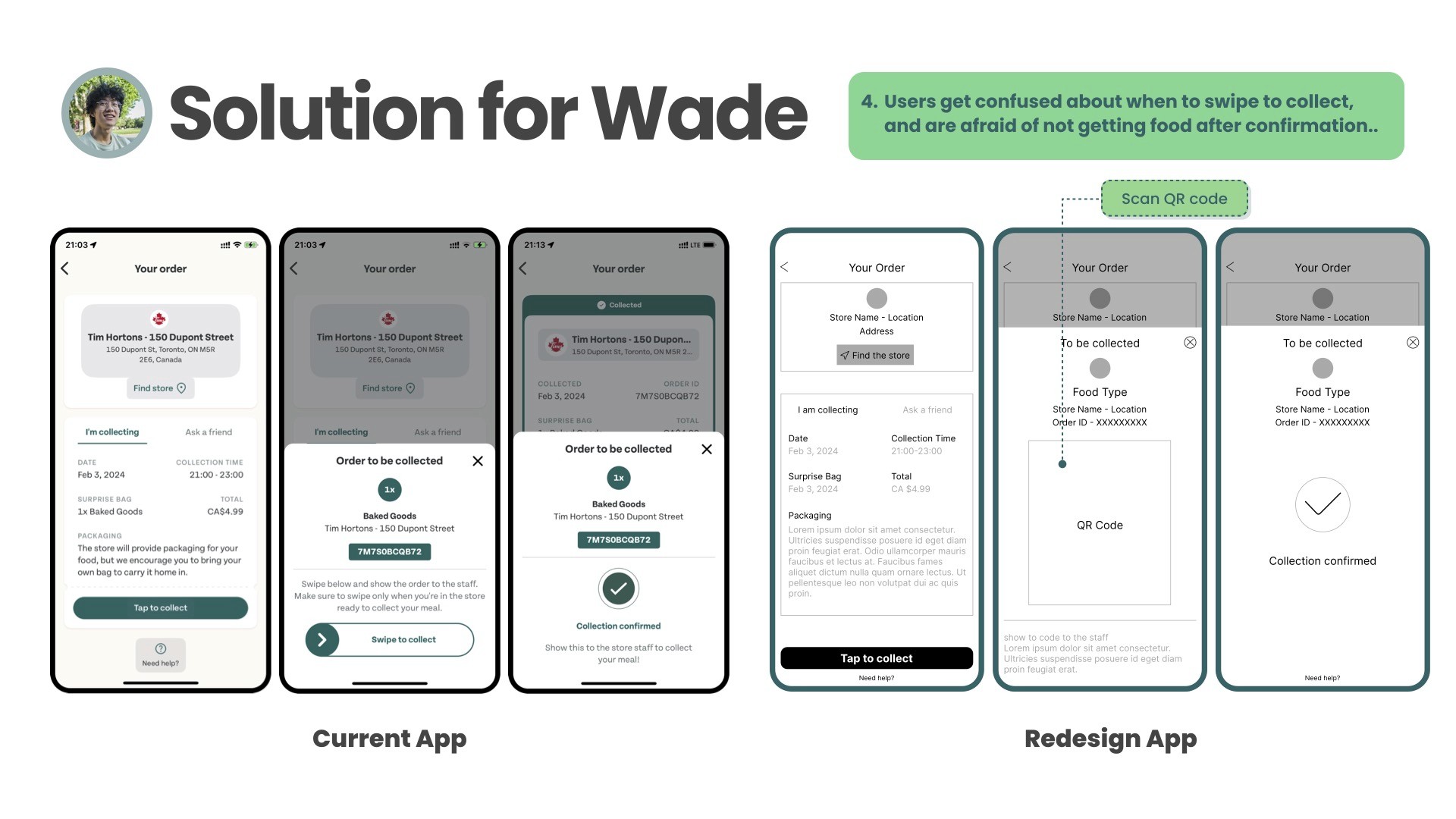
Confusing pick-up and confirmation process.
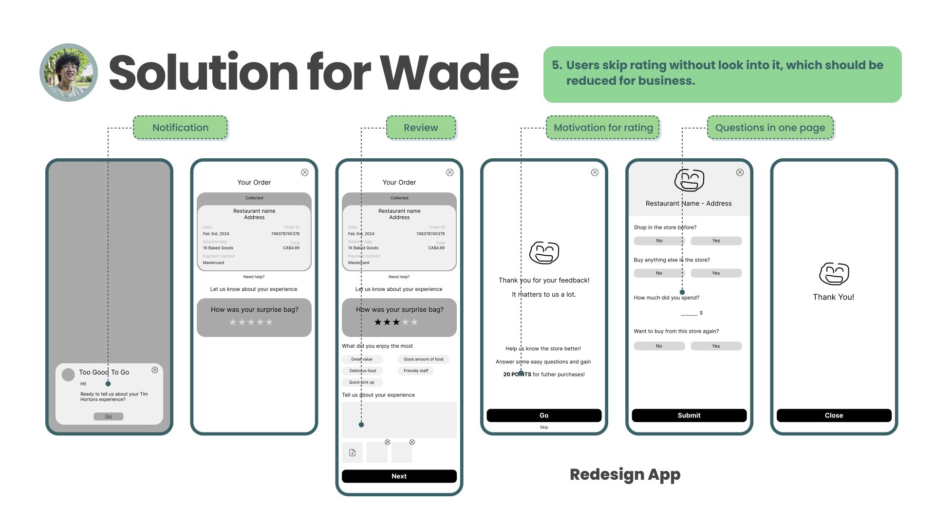
No integrated social proof or rating impact for users.
These challenges reduced trust and made the overall experience less satisfying — limiting both user engagement and business potential.
Research:
We conducted both quantitative and qualitative research to understand user behaviors and frustrations.
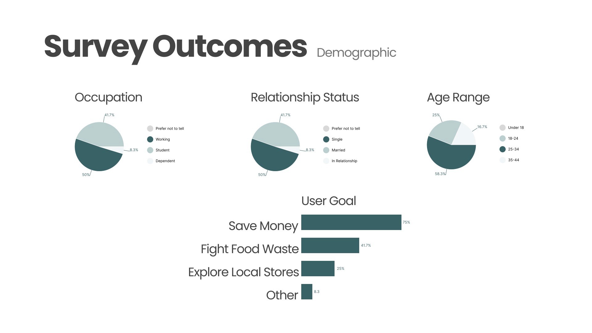
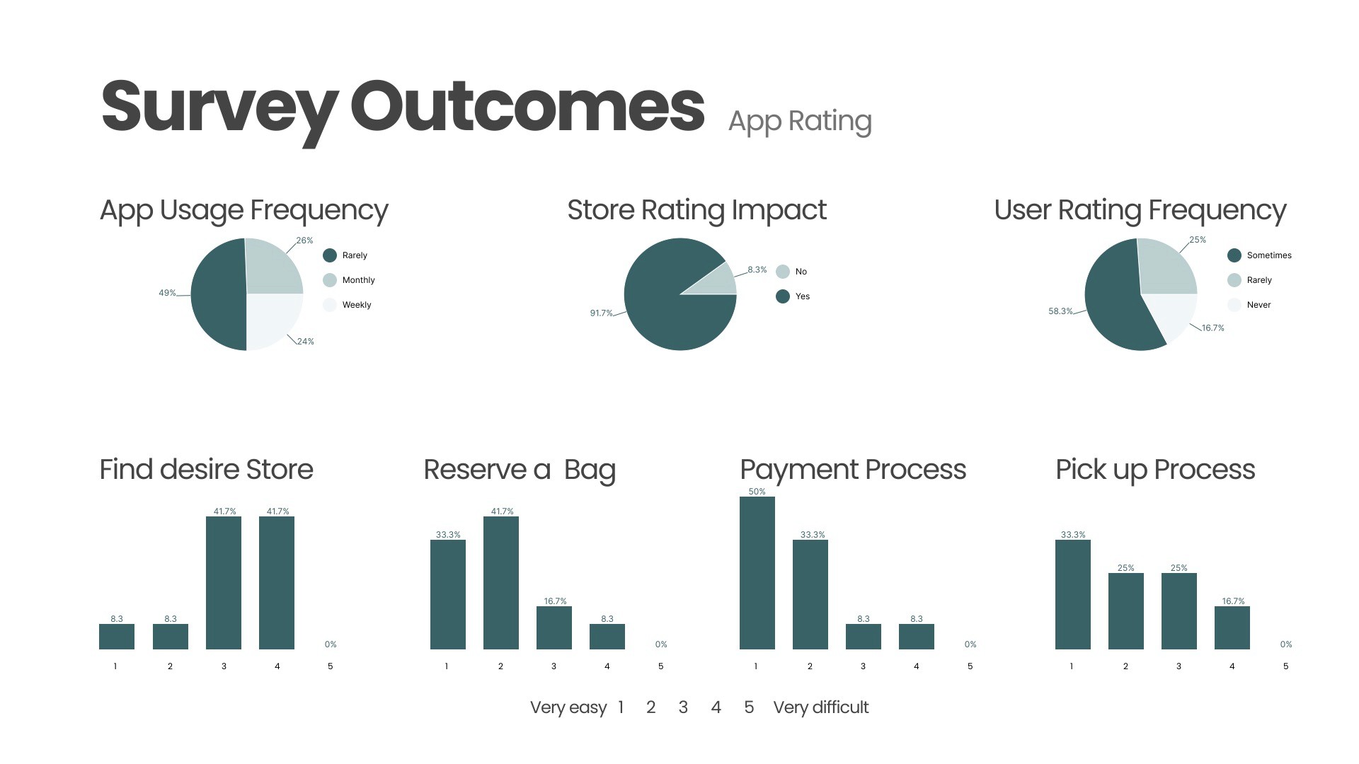
Survey: Gathered insights about demographics, motivations (saving money, fighting food waste), and friction points in the search and pick-up process.
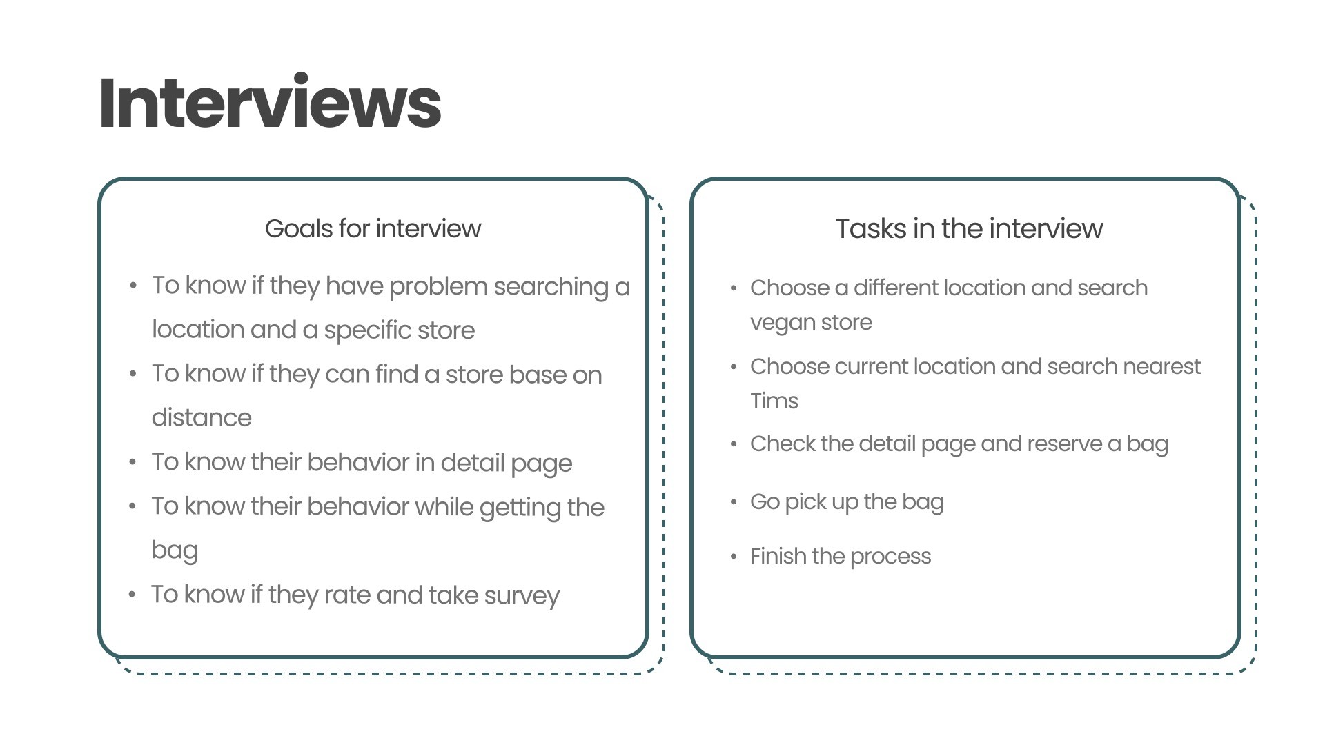
User Interviews: Observed participants performing tasks such as searching for stores, reserving, and collecting bags. I documented issues like difficulty using the map, missing dietary info, and uncertainty during pick-up.
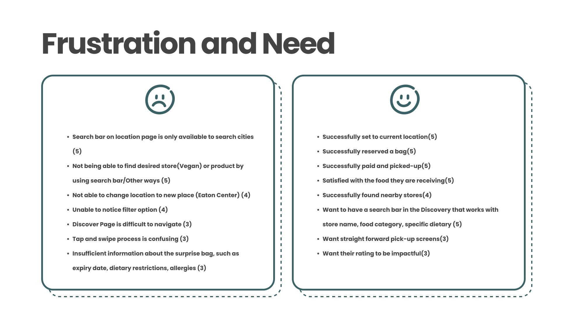
The data helped us uncover patterns in user expectations, shaping the direction of our redesign.
Planning:
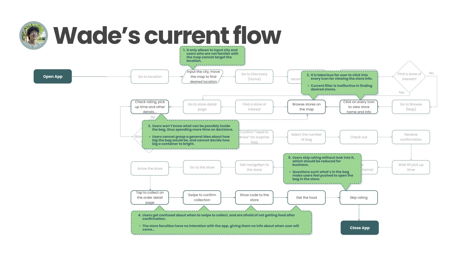
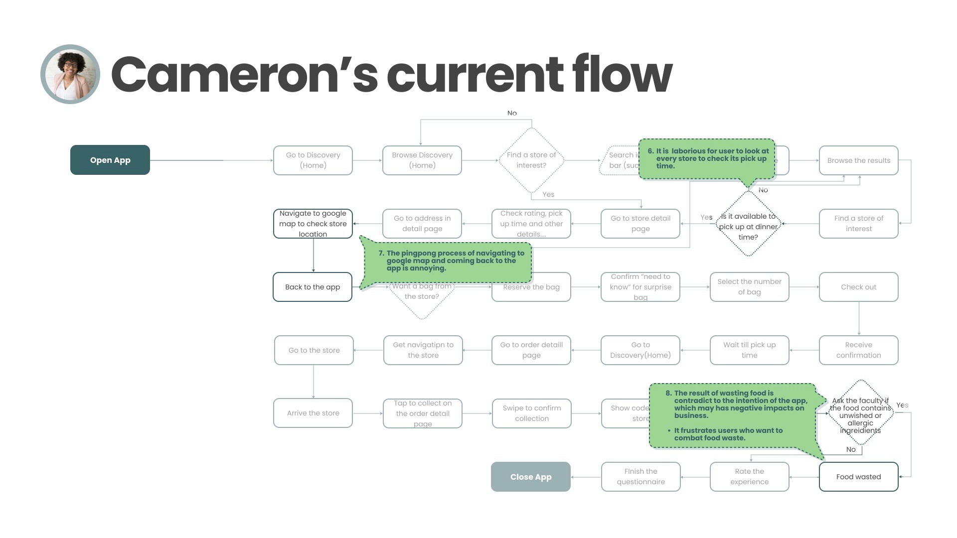
Based on our findings, we developed personas, user flows, and journey maps to visualize pain points and improvement opportunities.
I worked on creating Wade’s and Cameron’s scenarios — representing two key user groups:
Wade, a student looking for affordable, convenient meals.
Cameron, a parent focused on family-friendly and eco-conscious options.
These personas guided how we prioritized search functionality, visual clarity, and accessibility throughout the user flow.
Design Solutions:
Our redesign focused on solving key usability and clarity issues:
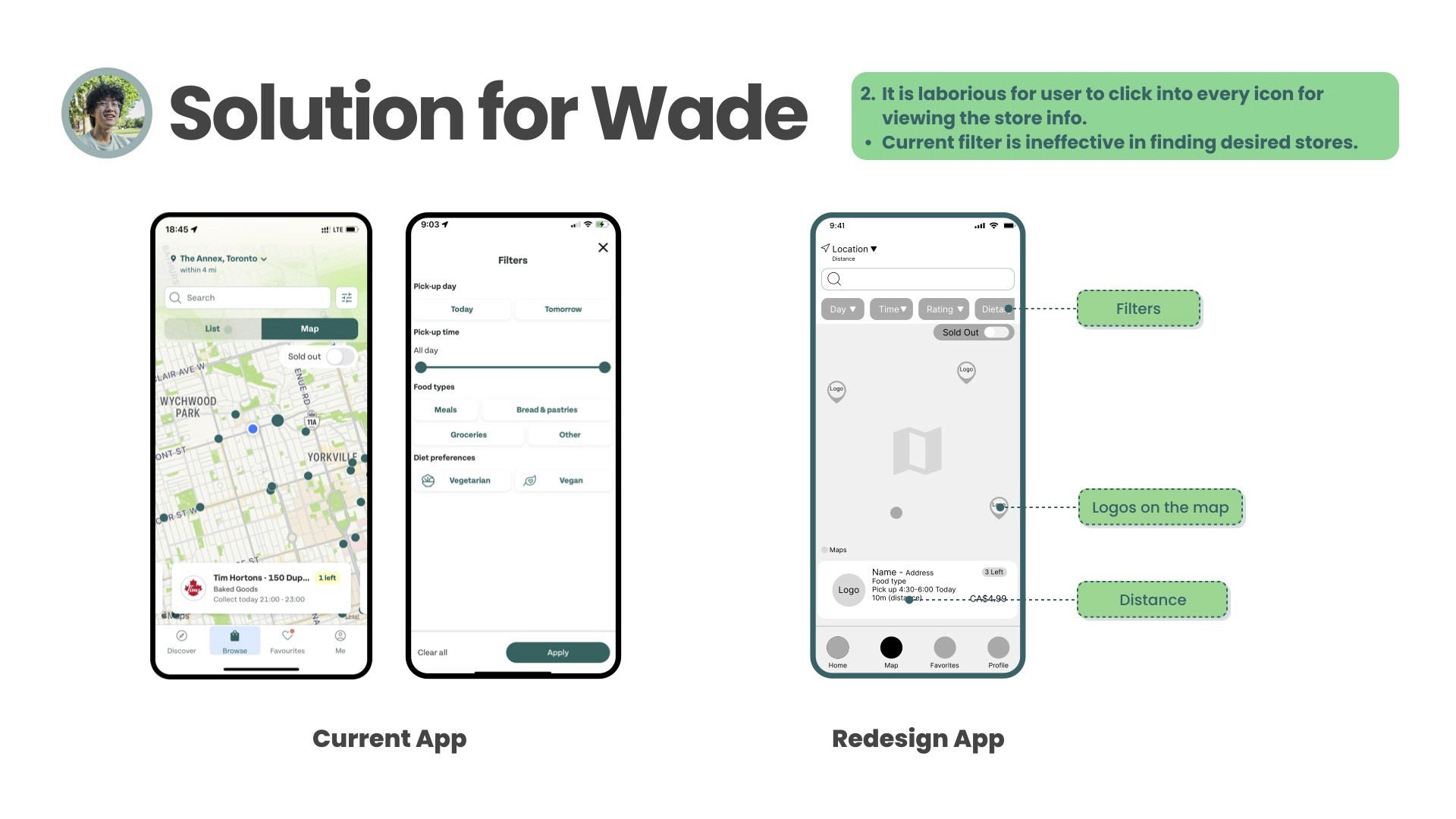
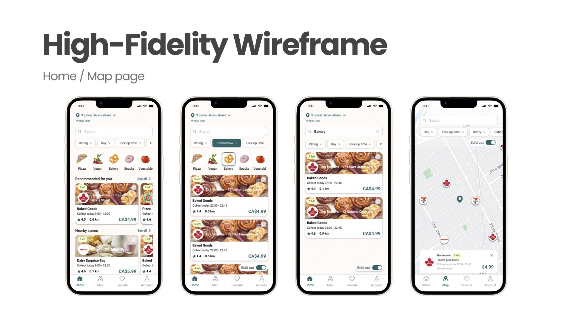
Smarter Discovery: Added filters for distance, dietary preferences, and pick-up time, plus a functional search bar for store names and categories.
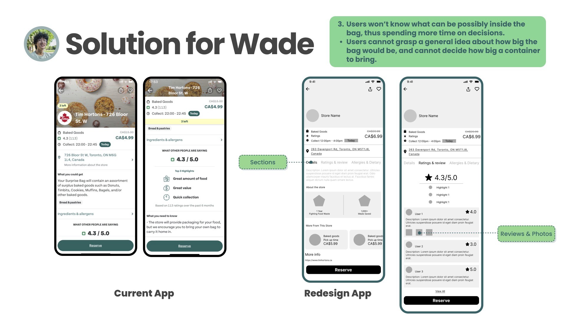
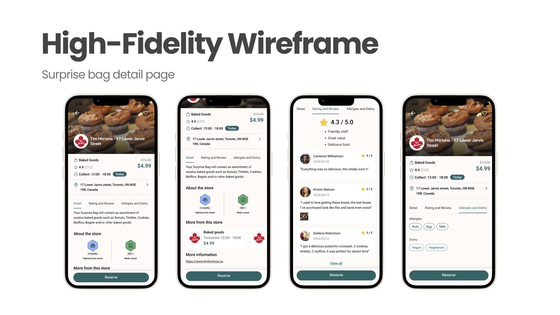
Clearer Store Details: Introduced sections for reviews, allergy tags, and pick-up information so users can make quick, confident decisions.
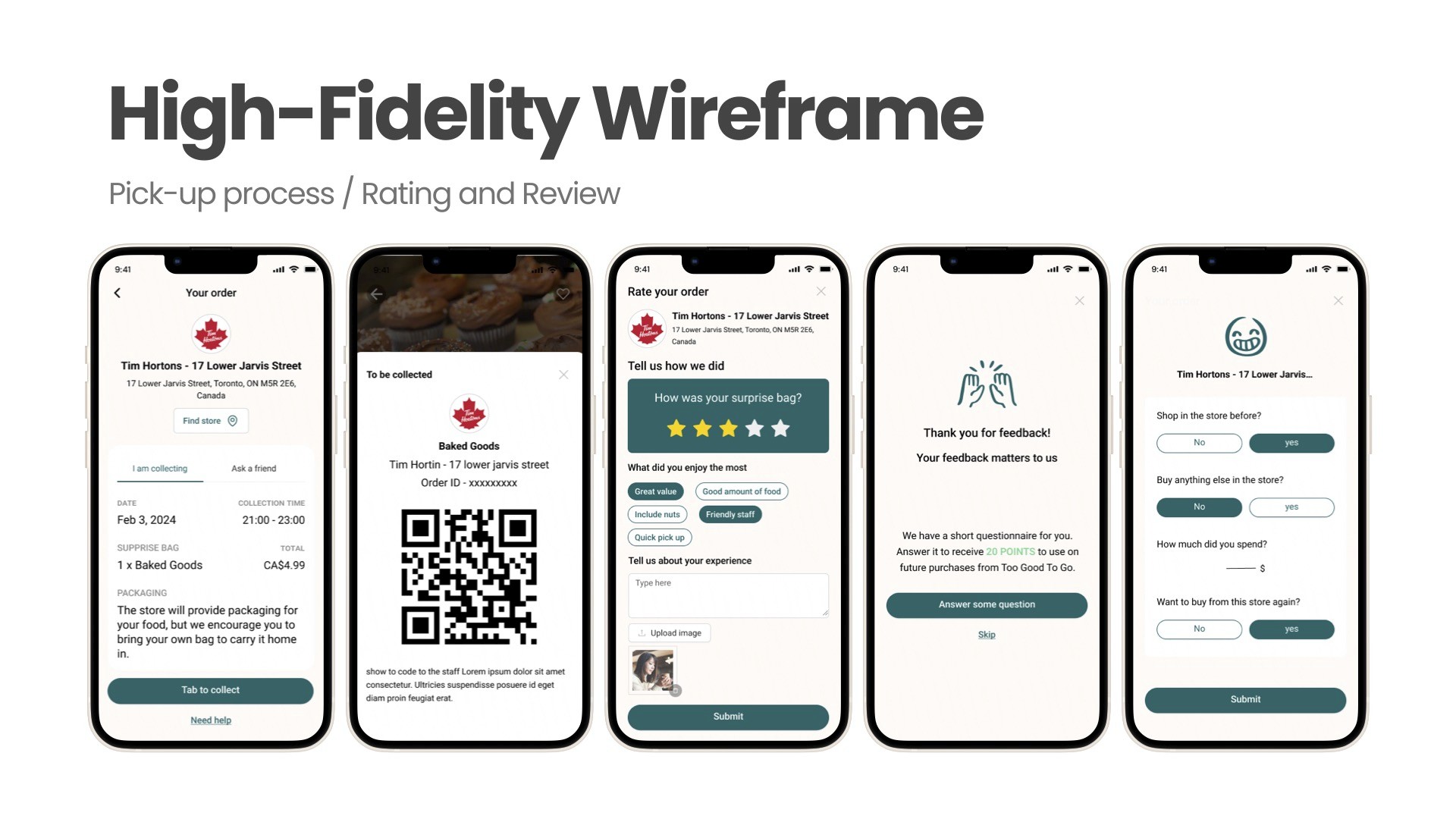
Streamlined Pick-Up: Simplified the confirmation step with QR code scanning, making it easier for both users and store staff.
Encouraging Feedback: Designed a new rating flow with reward points, motivating users to review and improve app engagement.
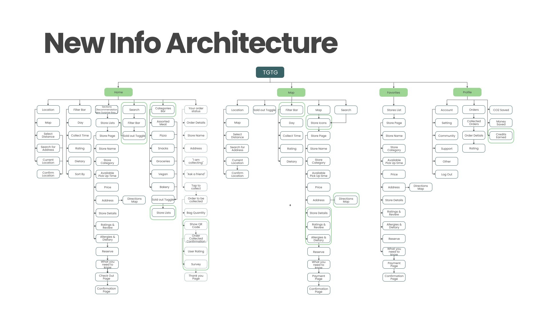
I contributed to defining new user flows and information architecture, illustrating how the new design improvements reduced friction and improved decision-making.
Project Reflection:
This project helped me understand how small UX details can greatly improve user confidence and brand perception.
Working as a team taught us how collaborative research and testing can translate complex feedback into clear, actionable design changes.
For me personally, leading the research phase and mapping user journeys strengthened my skills in information synthesis, flow design, and user empathy.
The project reminded us that good design not only enhances usability — it encourages positive, sustainable behavior through meaningful experiences.
More Projects


